
Asana Homepage
I want to start with what Asana gets right, because they get a lot right and I don't think that gets said enough.
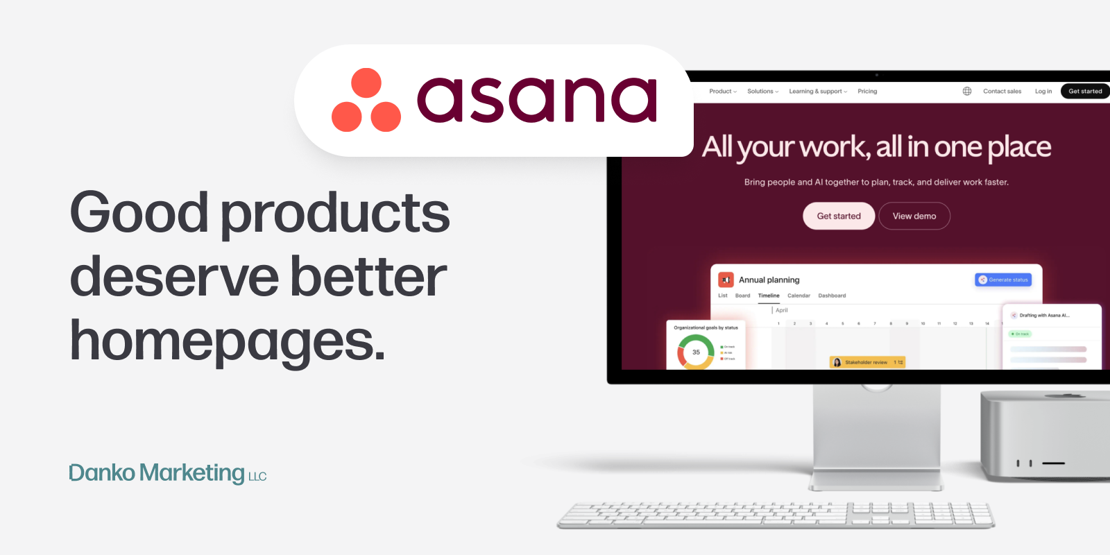
The branding is genuinely beautiful. Asana has one of the most distinctive visual identities in the entire SaaS space — a color palette that somehow manages to feel cozy and futuristic at the same time, balanced with shadows and glows that give the UI real depth without feeling heavy. The hero section is a good example of this working at its best. Minimal copy, a stunning UI screenshot, and intentional restraint in what they chose to highlight. They don't overwhelm you. They invite you in.
I noticed all of this because I've been a user for years. My first introduction to Asana was at a nonprofit, and I've come back to it at almost every job since. I've also used enough competing tools at this point (some beautiful, some genuinely terrifying) to know what good product design looks like. Asana's product design is excellent.
Which is exactly why what happens after the hero section is so disorienting.
The further you scroll, the muddier it gets. The AI messaging starts appearing everywhere and meaning nothing. The copy starts sounding like every other work management tool trying to sound modern. And the thing that makes Asana genuinely different (the way it connects people, goals, and work across an entire organization) gets buried under language so generic it could have been written about anyone.
I kept waiting for the humanness. Asana has always felt like a tool built by people who actually think about how teams work. But the homepage reads like it was written by a committee trying not to say the wrong thing. There's no UGC. No real customer voice. No moment where you see a real person talking about what changed when their team started using it.
I'm not sure why they approached it this way. But as someone who genuinely likes this product, it was hard not to feel like they were underselling themselves at every turn.
So I opened my notebook and started writing down what I'd change.
There's a pattern that runs through Asana's homepage, and once you see it you can't unsee it.
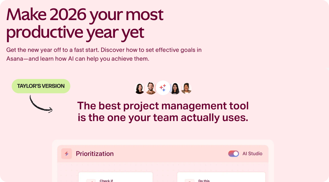
It starts before you even get to the features. Earlier this year, one of the first things a visitor would have seen was a headline that read: "Make 2026 your most productive year yet." It's gone now (quietly removed, probably because someone noticed what I noticed). It's a headline that could have been written by any productivity tool or any planner app trying to sound motivating in January. It has nothing to do with Asana specifically.
That headline is gone, but the instinct behind it isn't.
Scroll through the current homepage and you'll find the same pattern repeating. Words like "scale," "streamline," "AI-powered," and "productivity" appear so frequently they stop meaning anything. These are category words. They describe the space Asana operates in, not the reason to choose Asana over anything else in it. And when every tool in your category is using the same words, using them louder doesn't help. It just makes you harder to distinguish.
The frustrating part is that Asana has genuinely specific things to say. They have a goal-tracking system that connects company objectives all the way down to individual tasks across every team. They have AI that operates with context your team already built, not a blank chat window you have to brief from scratch every time. These are specific, defensible, hard-to-copy advantages.
But the copy keeps retreating to the generic instead of leaning into the specific. And the first place that showed up (even before I got to the features) was that headline about having a productive year.
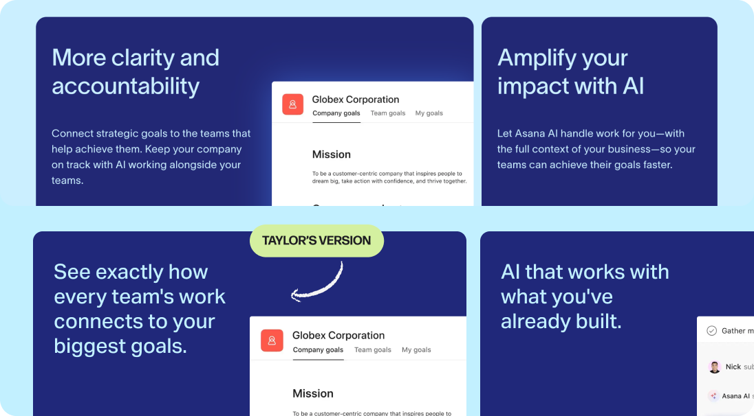
If you scroll past all the AI mentions and keep going, you hit a section called "What sets Asana apart." And this is where it gets interesting, because this section is actually close to getting it right. It's just not there yet.
Asana uses two cards here, each with a UI screenshot and a headline. And the screenshots are doing real work. The left card shows a goals dashboard (company objectives broken into team goals, tracked with progress bars, connected all the way down). The right card shows Asana AI operating inside a live workflow, setting priority, completing research, assigning work to a real team member. These are not generic product screenshots. Someone made intentional decisions about what to show here, and those decisions were good ones.
The problem is the headlines aren't keeping up.
The original copy uses the kind of benefit language that feels meaningful until you try to apply it to a specific buyer decision. It describes outcomes in the abstract rather than naming the advantage directly. A busy team lead scanning this page isn't going to slow down for abstract. They're going to keep scrolling.
The fix I kept coming back to was simple: say exactly what the visual is already showing. If the screenshot shows every team's work connecting to company goals, then say that. If the screenshot shows AI working with context your team already built instead of starting from a blank prompt, say that too.
So that's what I did.
The rewrite on the right tightens both headlines to match what's already on screen. Card one became "See exactly how every team's work connects to your biggest goals." Card two became "AI that works with what you've already built." Neither line is trying to be clever. They're just being specific, which, on a homepage full of generic copy, is its own kind of differentiation.
The biggest thing Asana is missing
Here's what makes this section of the critique different from the last two. The copy problems and the headline problems are fixable with better strategic thinking and sharper writing. What I'm about to point out is a different kind of miss, because the assets already exist.
Let's start with the homepage social proof section. The headline reads "The world's top companies trust Asana." And then you get logos. Clean, recognizable, enterprise logos. Which is fine, logos matter for credibility. But credibility gets you on the shortlist. It doesn't get you the decision.
What gets you the decision is when a buyer sees someone who looks like them, describing a problem they recognize, explaining why Asana was the answer. That's not on this page. And the maddening part is that Asana has that content in abundance, it just lives entirely on YouTube.
Go to Asana's YouTube channel and you'll find two things that should absolutely be on their homepage. First, beautifully produced customer testimonials and case studies. Real people and real companies, filmed and edited with the same visual polish that makes Asana's brand so distinctive. "How E.ON Next uses Asana to drive innovation and achieve net zero." "How Clear Channel saves 15 hours on every creative brief." These aren't amateur customer quotes. They're mini documentaries about what changes when a team actually commits to the platform.
Second, an enormous organic creator community. Tutorials, workflow breakdowns, productivity systems built entirely around Asana, made by real users who love the product enough to build content around it. Natalia Kalinska. Marquis Murray. Creators with tens of thousands of subscribers teaching people how to get more out of a tool they chose voluntarily. That's not just social proof. That's the most credible kind of marketing that exists, and it's sitting completely unused on the homepage.
And then there are the product announcement videos. If you've been an Asana user for any amount of time you know exactly what I'm talking about, the "What's New" series. Quick, beautifully animated, to the point. They've been doing this campaign for years and somehow it keeps getting better. These videos do something the homepage copy never manages to do: they make the product feel alive. They make you feel like you're part of something that's constantly improving and that the team behind it genuinely cares about the craft.
Asana is not a company that doesn't know how to tell a story. They tell it beautifully, constantly, on YouTube. The homepage just hasn't caught up yet.
A full-width video testimonial, one real customer, shot simply, talking about before and after, would do more for conversion than any headline rewrite. A UGC strip pulling in creator thumbnails would signal community in a way that no logo wall ever could. And a single featured product announcement video, embedded somewhere on the page, would remind visitors that this is a brand with a point of view and the creative confidence to express it.
The content exists. Someone just needs to make the case internally that the homepage is where it belongs.

Final remarks
I want to be clear about something before I close this out: I like Asana. I've liked it for years. I've recommended it to teams, built workflows inside it, and watched it genuinely change how people collaborate. That's not a disclaimer, it's the whole point. Because the gap between how good this product is and how it's being presented on the homepage is exactly what made this teardown worth writing.
Asana is not losing on product. They're not losing on design. They're not even losing on content, as we've established, their YouTube channel is doing things their homepage has never attempted. What the homepage is losing on is conviction.
The copy retreats to generic when it should lean into specific. The AI story gets scattered across the page when it should be told once, clearly, with context. The human element (the thing that turns a credible tool into a beloved one) is almost entirely absent, despite the fact that Asana has some of the most compelling customer stories in the category sitting unused on another platform entirely.
And none of this is a small stakes problem. Homepage positioning isn't just about first impressions. It bleeds into every sales conversation, every demo call, every proposal deck an AE sends to a prospect. When the homepage can't articulate what makes you different, neither can your sales team. When the homepage doesn't make buyers feel something, the product has to do all of that work alone — and no product, however good, should have to carry that weight by itself.
Asana has something worth saying. They have the brand, the product, the community, and the content to say it beautifully. The homepage just needs to catch up to the rest of it.
That's what a positioning problem looks like from the outside. And that's exactly why it's worth fixing.
