
Obsidian vs. Notion

When I want to analyze website copy for a company, I always start with their mission statement
The world of technology is constantly evolving and chasing the next big thing. I've begun to criticize their messaging and positioning against their mission statements because that gives me insight into their integrity. For each product launch or feature release, are you staying true to the reason you started building your product? Does every word on your page tie back into the vision you see for the world if everyone used your product?
It's a high bar, but if you're asking people for their time and money, it's a reasonable ask. I mention all of this because these two brands will show you what a difference it makes when you ensure that consistency.
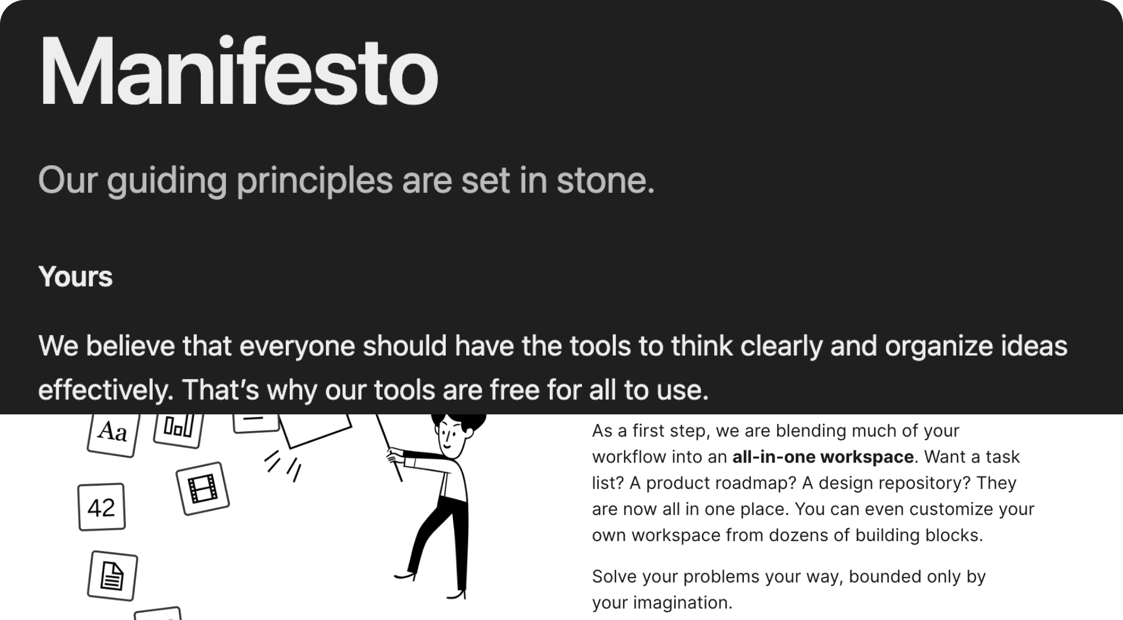
Obsidian's mission: We believe that everyone should have the tools to think clearly and organize ideas effectively. That's why our tools are free for all to use.
Notion's mission: We want to blend your workflow into an all-in-one workspace.

Let's start with the homepage.
Looking at the image above, you can see their hero copy. Next, I'll pull the headlines down the pages so we can see if they line up with those statements.
Obsidian:
- Your thoughts are yours.
- Your mind is unique.
- Your knowledge should last.
- Spark ideas.
- Sync securely.
- Publish instantly.
Notion:
- AI where your team works.
- Capture knowledge
- Find answers
- Automate busywork
Now, not everyone will stop at just the headlines on the page, but they give us clues to what their features are. With Obsidian, they are hitting on each way that they created a tool to allow clear thinking and organization. They also tug on this emotional string many of us might be feeling with the rise of LLMs using our data/words to further train AI technology. In some ways, they're also using security and memory as a way to illustrate how they organize our ideas for us.
Notion's homepage is concise, which is a newer approach to homepage layouts I think we'll start to see more of this year. Across their headlines, it ties back to them being an all-in-one, except for automating busywork. Across the page, it seems clear that they are driving home the message that they have AI agents. That's where they lose me a bit.

I'll admit I'm a little biased, I love Obsidian's site structure.
It's clean, minimal, and to the point. However, I do think that matches exactly what they strive for when they are building their product and a world that could run on Obsidian. This is such a beautiful approach because you can see them lean into exactly what they stand for and their website reflects that. From what I can see on their site, they are also not arguing that they are an org-wide tool. When I read their copy, I envision them speaking to the person, rather than the team.
For Notion, this is where I am a little picky. Across the board, they don't seem to have a bunch of website pages just to fill space. When it comes to their features page, that's where they roam away from their core messaging.
On that product page, they have 4 sections that are essentially big buckets that their features fall into. Under each section, they have tiles that outline exactly what that "bucket" of features is capable of. Across the page, there's 39 tiles.
Their claim at the top of this page says: Capture your team’s knowledge, find answers across all your apps, and automate your busywork.
As I continue to read, I also have no idea what they consider "busywork" to be and that would be worth making clear if it's going to be such a large pillar for them. With that, how are you blending my current workflow into an all-in-one place? Is my workflow busywork? Or, which parts of it do you think you can take off my plate?
With that, under their "Automate busywork" section, many of these features require me to do things. I have to build the agent, create skills, and "orchestrate agents." If the goal is to automate busywork, I wouldn't want more added to my plate.
I will say, they've also REALLY trimmed the fat from their site which I love. They had a lot going on just a few months ago and I love that for every feature on their product page, they link it to an article rather than another website page with more copywriting. Where they are still lacking is the ability to show me the benefits. I can see the value and features, but I am not clear on your benefit to me as much as Obsidian does. I'm left wondering... what is my busywork... and where did you automate it for me...
After reading their sites comprehensively, it feels like they're hitting two different audiences.
It also feels like Notion is for a much larger audience compared to Obsidian. In trying to be fore everyone, Notion's messaging falls flat for me as a product marketer. If I hadn't used their tool before, I would be lost on what an AI agent is to Notion. I also think that having such a daunting task of setting up an AI agent goes against them wanting to blend a users current workflow. There could have been more thought into how they can meet people where they are rather than building AI for the sake of building it.
For the all-in-one aspect, Notion hits this outside of their references to AI. That's where the pain is for most people: having a bunch of sh*t but not being able to ever find it. Obsidian doesn't claim to be that kind of solution, so I can't hold them to the same functionality. Across the board, their websites have done a fantastic job of being purposeful and well thought out. It's also fascinating to see design become much more minimalistic as this year goes on.
Depending on who you are, you have two different tools to meet you there. It just depends on what you care about the most.
