
Trello Homepage Teardown
Trello has a good product and a genuinely great-looking homepage. But the more I read it, the more I realized I wasn't sure who it was actually for. That's not a design problem, it's a positioning problem. Here's what's working, what's not, and what I'd change.
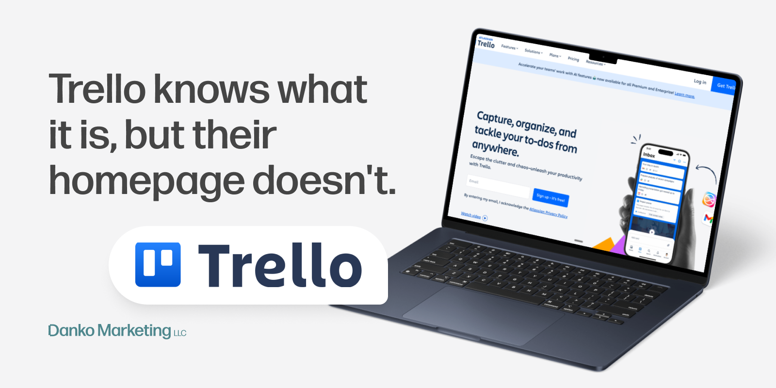
The headline, "Capture, organize, and tackle your to-dos from anywhere," is clean and active. I liked it. But then the subhead immediately undercuts it. "Escape the clutter and chaos; unleash your productivity with Trello" doesn't add anything new, it just restates the headline with more buzzwords. Cut it.
The bigger issue is the hero image: why the Inbox UI? On first glance this reads like an email client, not a task management tool. The more I read the page, the more I realized Inbox is clearly what Trello wants to lead with, but the headline is still written like a generic task app.
The image and the copy are telling two different stories, and that disconnect is what makes the hero feel slightly off even though the individual pieces are fine.
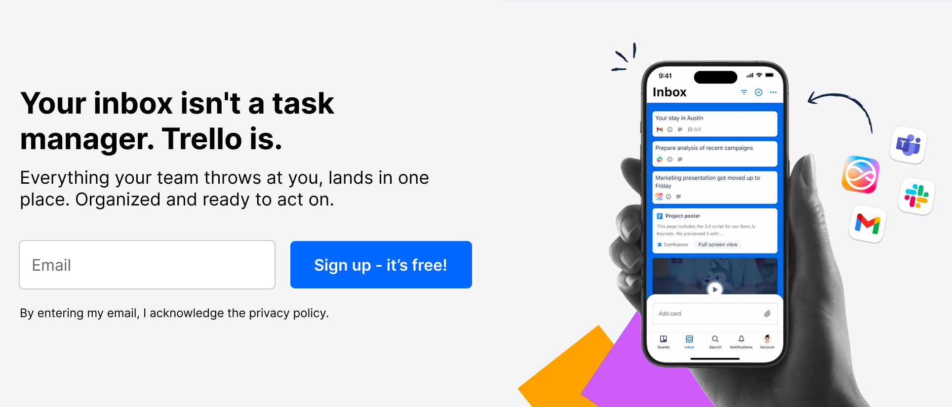
If you're going to bet on Inbox as your differentiator, your headline needs to earn that choice. Something like: "Your inbox isn't a task manager. Trello is." Then let the subhead do the specific work: "Everything your team throws at you, lands in one place. Organized and ready to act on." Now the image, the headline, and the subhead are all pulling in the same direction.

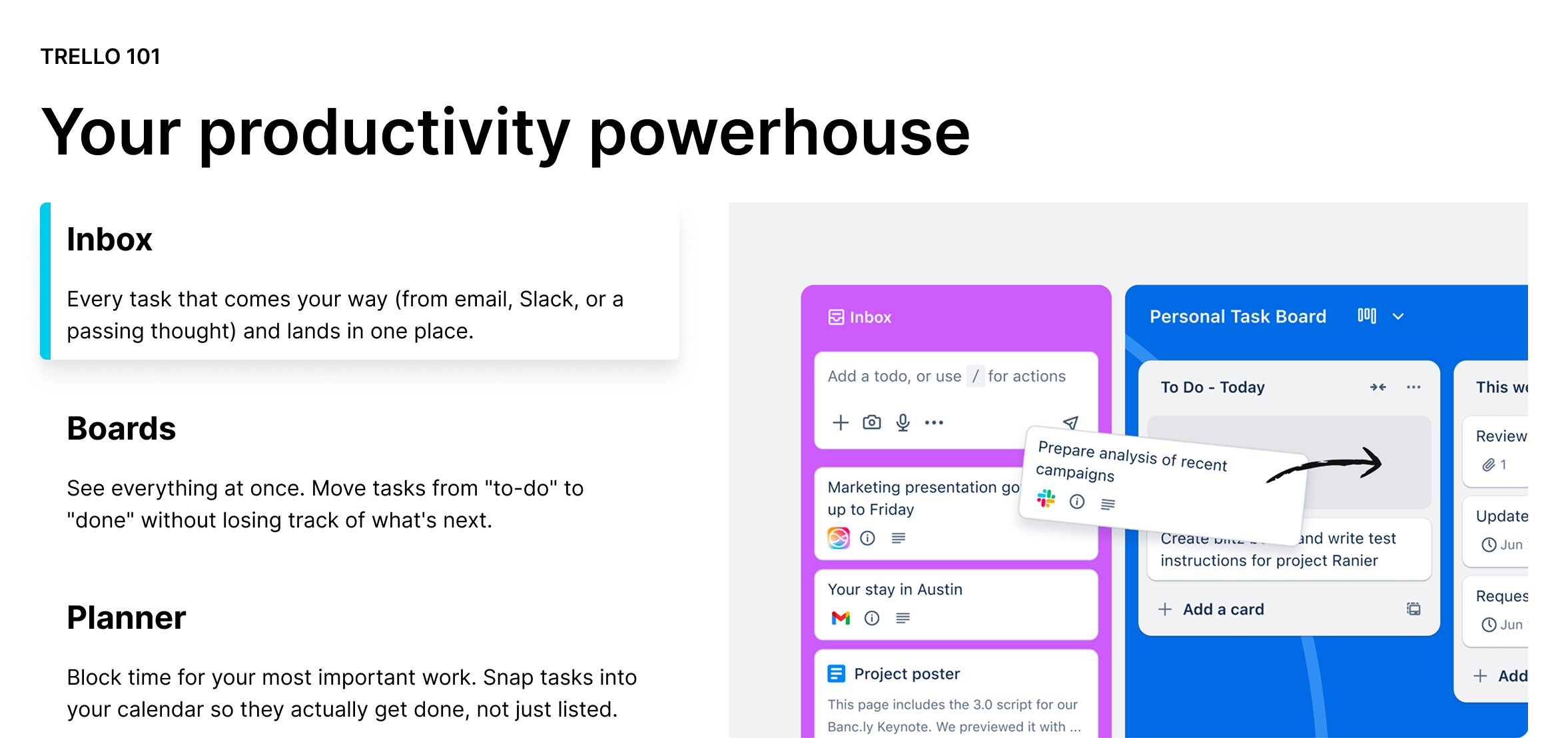
The section title is fine. The problem is everything underneath it.
Inbox, Boards, and Planner each get their own blurb, but they all feel like variations on the same sentence. By the time you reach Planner, you've already tuned out. The copy tries to explain three features at once and ends up saying nothing clearly about any of them.
The Boards section in particular left me wondering: why boards, specifically? Is the board view better somehow? Does it auto-sort? I use boards constantly in other tools and still couldn't tell you what makes Trello's version worth calling out. The copy never makes the argument.
The bigger miss is that none of it answers the most important question: is any of this automatic? If Trello is pulling tasks from my apps and organizing them for me, that's genuinely compelling. If I'm still doing manual entry, that's a much harder sell, and the copy never makes the distinction.

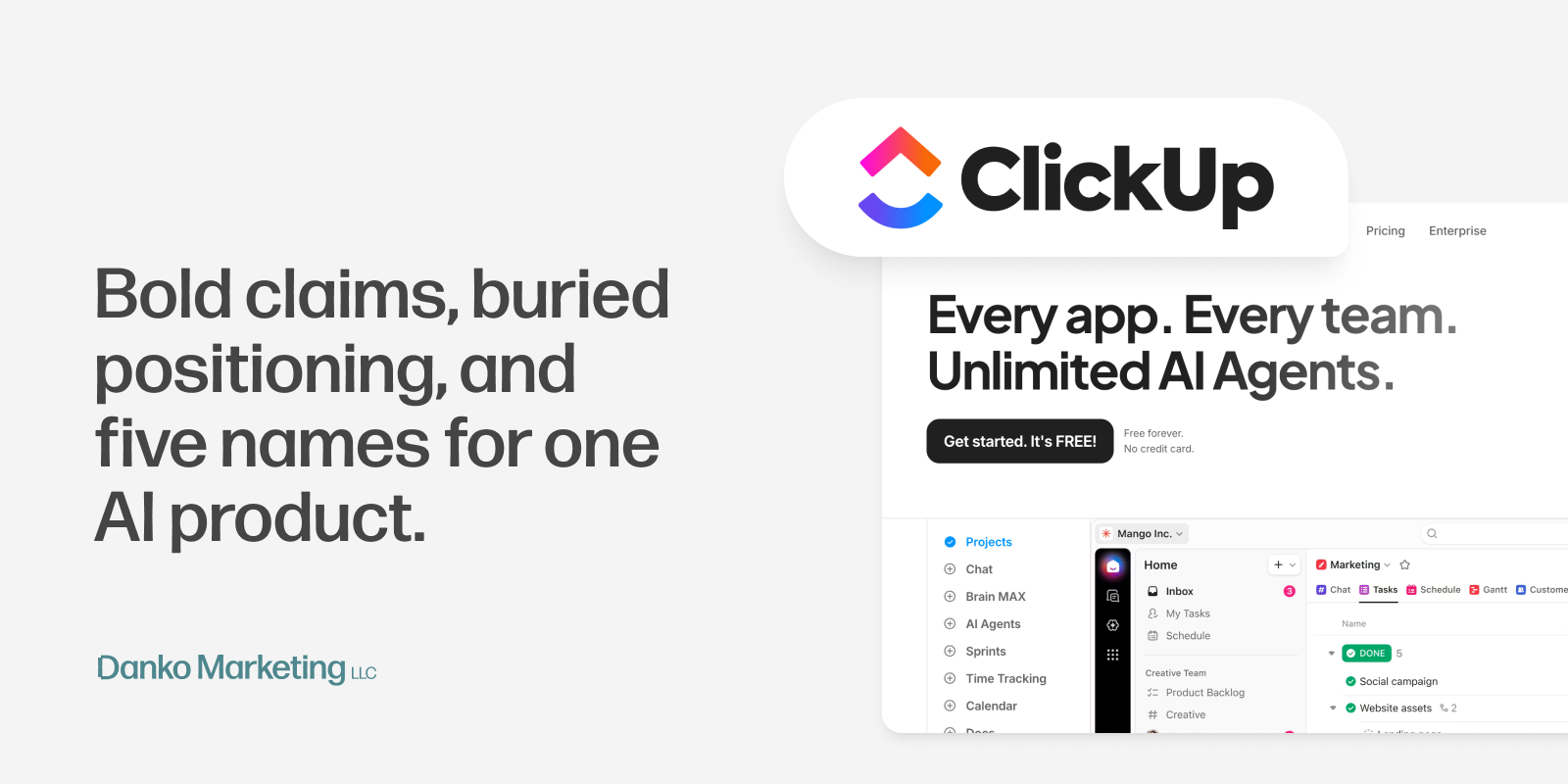
We're in an era where dropdown menus are information graveyards. ClickUp's nav, for comparison, lists 20+ items across five categories with colorful icons and section headers. It reads less like navigation and more like a product catalog for a company selling 20 different things. Notion and Asana have similar problems. The nav becomes its own overwhelming experience before you've even reached the homepage.
Trello's is different. But the detail I kept coming back to isn't the layout, it's one word. They use "Features" instead of "Products." That's not an accident. "Products" implies a suite: separate tools, possibly separate pricing, a bundle you have to untangle. "Features" implies one app with a lot built into it. It's a quieter, lower-stakes invitation to explore, and for a tool competing against platforms that feel increasingly complex, that word choice is doing real positioning work before anyone clicks anything.
The dropdown copy is still a little heavy in places and could be tightened, but the structure and restraint of the nav overall is worth studying.


Trello is in the middle of a pivot they haven't fully committed to in their messaging yet.
The product they seem to be building, the one that shows up most clearly in the Inbox and "From Message to Action" sections, is a task aggregator for people whose work is scattered across too many apps. That's a specific, timely, and genuinely defensible position. In a world where the average knowledge worker lives across four or five tools simultaneously, "the place where all your tasks actually land" is a real job to be done.
But the homepage still hedges toward the generic productivity story: capture to-dos, organize your work, be more productive. That's everyone's pitch. Todoist, Asana, Notion... they're all saying some version of the same thing.
The bones are good. The design is excellent. But right now the messaging is trying to speak to everyone, which means it's not fully landing for anyone. Commit to the inbox angle, tighten the feature copy, and Trello has a homepage that actually matches the product they're building.
Check out more of my work

Want to connect?
