
ClickUp Homepage Teardown
I've been watching ClickUp for a while. They built their whole brand on being the project management tool that could do everything — and lately they've gone hard into AI. I went in expecting a sharper message. What I found was a page that's clearly going through something. Here's my honest read.
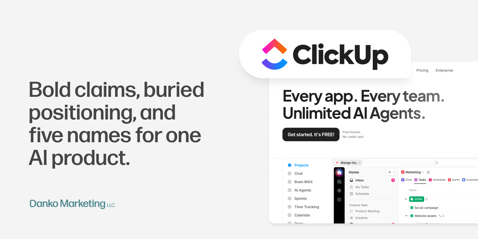
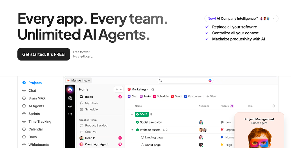
Before you've scrolled once, you've already been hit with four different messages. The main headline says "Every app. Every team. Unlimited AI agents." There's a rotating banner above the nav about super agents. And a panel on the right listing three more promises about replacing your software and maximizing productivity.
I get it — they have a lot to say. But this is the homepage, not a feature dump. When everything is the headline, nothing is.
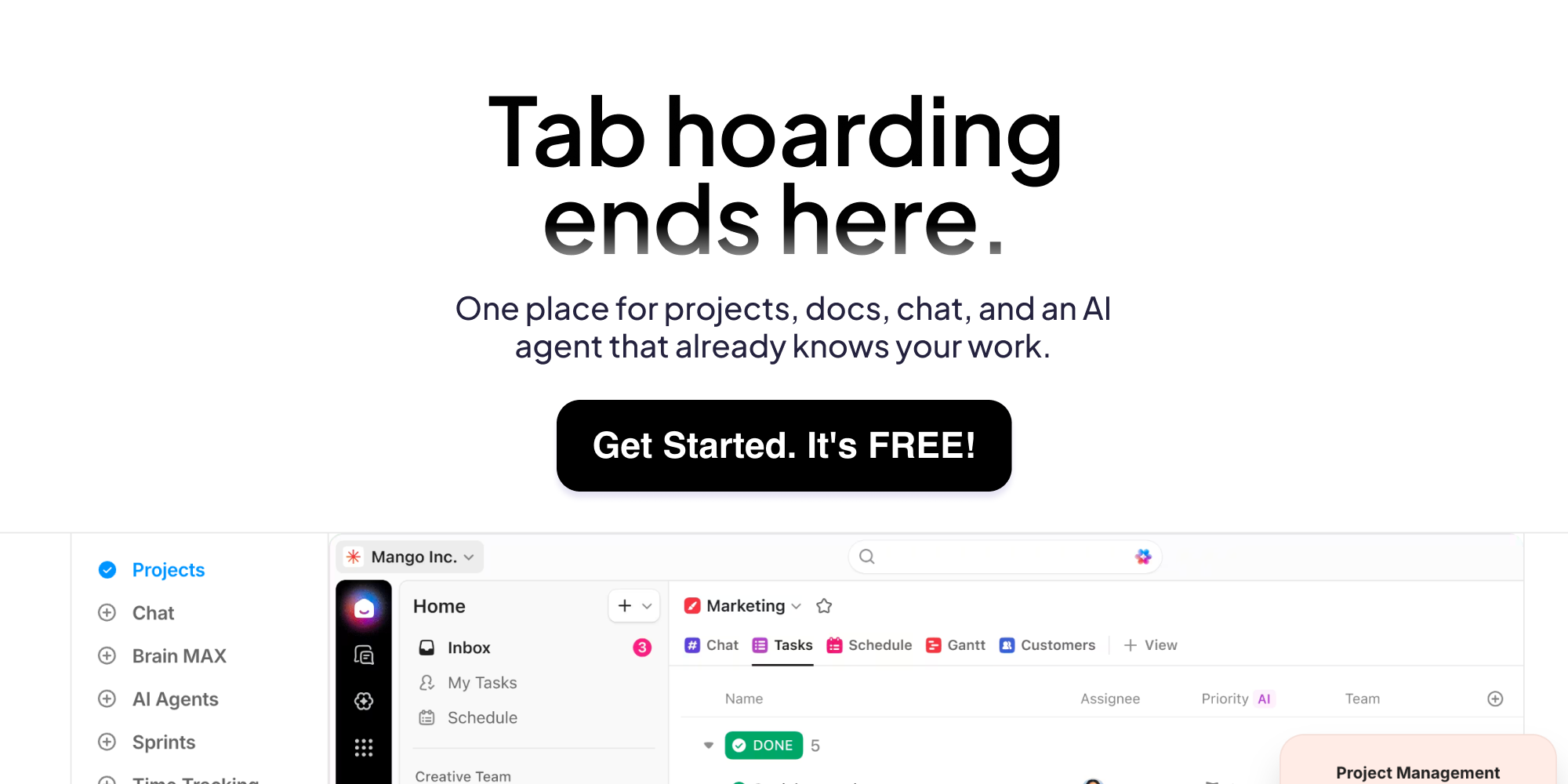
The hero UI preview is genuinely pretty. But it's so busy that I couldn't tell what I was looking at, let alone how it connected to anything above it. And here's the thing — the people landing on this page probably already know what ClickUp is. They're not strangers.
They came with a specific question, likely something like "okay what is Brain and should I care?" This page is too busy performing to answer that. You can recover from not converting cold traffic. Losing warm traffic is harder to come back from.
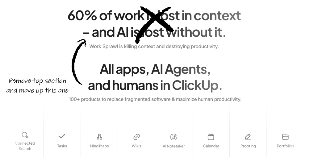
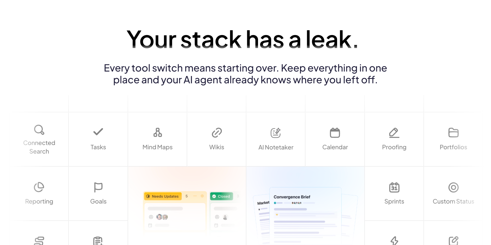
About halfway down there's a section breaking down three concepts (context switching, context missing, context stitching), backed by stats about productivity loss and AI adoption failure rates. Real numbers, real problem.
Then immediately after: "100+ products to replace fragmented software and maximize human productivity."
These are the same argument. Problem, then solution. They just put a vocabulary lesson in between them, which completely kills the momentum. By the time you get to the solution you've already mentally checked out.
It's not really a copy problem, it's more of a structure prblem. Collapse them. State the problem, back it with one number, show the solution. That's the whole section. Every time your team switches tools, context drains out. Keep everything in one place and your AI agent already knows where you left off. Done.
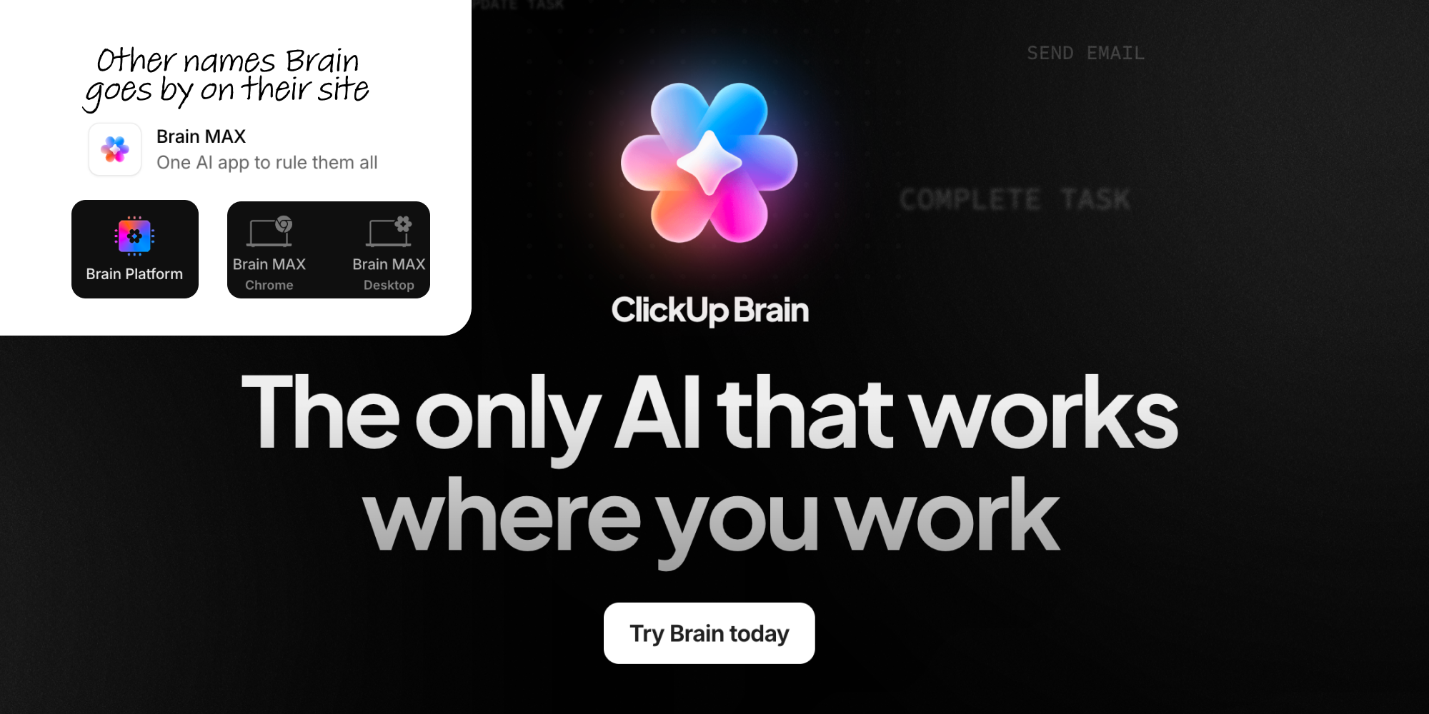
Okay so this one genuinely broke my brain a little.
The nav says Brain AI. Open the dropdown and you get Brain Max. Click through and there's Brain Platform. Scroll the homepage and it's ClickUp Brain. Read the feature section and now we're talking about Super Agents.
I spent way too long trying to figure out if these are tiers, separate products, or just different marketing names for the same thing. After about 20 minutes I think I pieced it together — Brain is the AI layer built into ClickUp that has context on your actual work. Brain Max looks like a separate downloadable app, more of a standalone AI tool. Super Agents are the autonomous "delegate everything" pitch. Three different products, three different value props, one deeply confusing naming system.
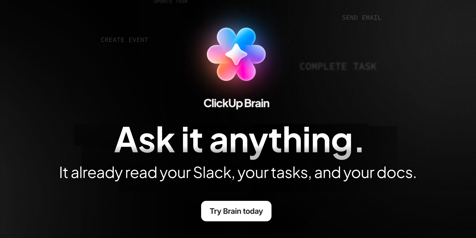
And then there's the section headline: "The only AI that works where you work." I'm sorry but every AI tool could say that right now. That's not a differentiator — that's a category description.
The thing that actually makes Brain interesting — that it has context because it lives inside the same place your work lives — never gets said. Not once on the whole page. That's the pitch. That's the thing that separates it from just opening a ChatGPT tab. And it's completely buried under five product names and a tagline that says nothing.
The positioning is in there somewhere. "Replace your stack" is a strong angle. The AI context story is genuinely differentiated if they'd just say it plainly. But this page is trying to carry too much at once... too many sections making the same point, too many product names for what might be one product, too many headlines competing for attention in the same scroll. You shouldn't have to do detective work to understand what a tool does. If you do, that's not a design problem. That's a positioning problem.
Check out more of my work

Want to connect?
